Evaluate the adverts (Unit 20: M3,D2)
Learning outcome 3 (Unit 20): Be able to produce the planned media components
Explain how the created media components comply with the codes and conventions of the media sectors (U20 M3)
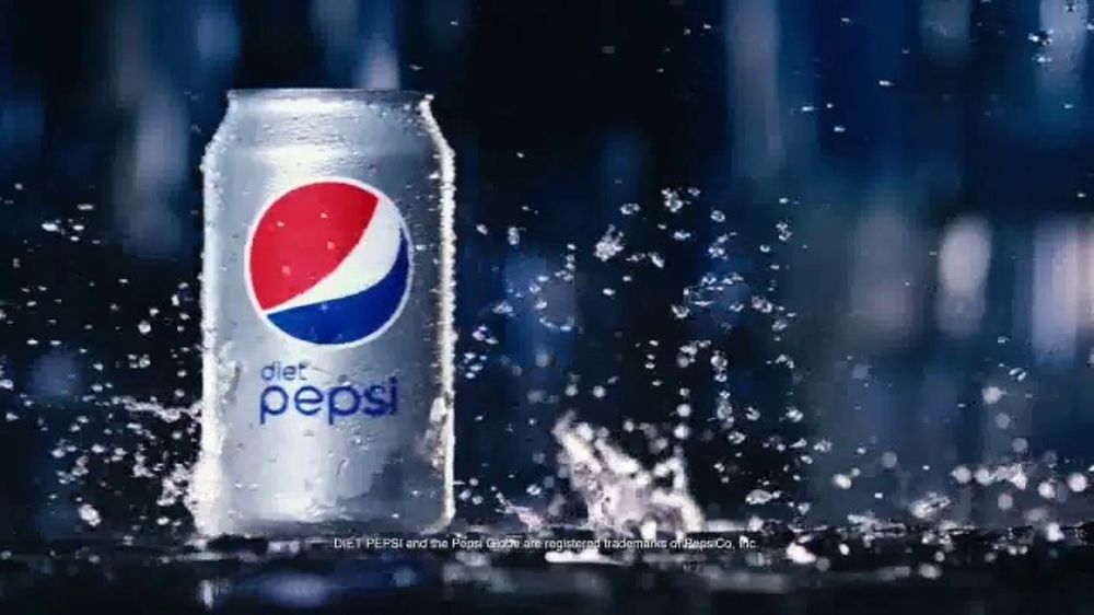
 For our video advert we got an idea from the McDonald's quarter pounder advert and how the main character changed clothes to show each of the years from past to present. We decided to take a twist on that as we saw it was popular so we decided to do changes of clothing. We thought this would be popular as the music makes the video and having our main character dance round to each of the songs created an upbeat feeling to the video which will make people enjoy it more. By making it humorous it will be shared around and be even a good word of mouth review and therefore it will give us more brand awareness and we could become as popular as brands such as Diet Coke and Pepsi as they are the drinks people automatically think of when people suggest fizzy drinks. We stuck to the codes and conventions for a video advert as we showed the product we were selling and we didn't make it misleading. We also used a voice over at the end to say our slogan. This is a code and convention of an advert as it is used in many adverts to sell the product with enthusiasm.
For our magazine and billboard we looked in to magazine adverts for various other drinks such as Coca Cola, Innocent smoothies and Pepsi.
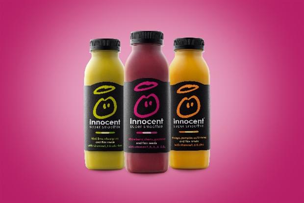
In the Innocent advert above, a vibrant colour scheme is used, so that the fruitiness of the drink is implied by the tropical colours - the pink background suggests fruit, and also helps to offset the splash of yellow and green in the bottles. The branding is fairly simple and uncluttered, focusing in on the bottles and the contents inside. We were inspired by this simple use of colour in our own ad, adapting the idea of having a plain, single-coloured background. We added bubbles to drive home the point that this is a fizzy, fruit-flavoured drink.
These gave us the idea to do a simple yet vibrant and catchy billboard and magazine advert. We decided to make them similar to keep with a theme so when people see one and the see the other they will recognise that they are from the same brand hence why we picked the same colour scheme and the same type of layout.


We liked the fact we added the #feelthefizz at the top as people can share it with the # and keep the trend going helping with our brand awareness. For our magazine advert and billboard advert we followed the codes and conventions by putting them in portrait for the magazine and landscape for the billboard this is so it will fill the space correctly. We used a picture of the can to show what we were selling and our slogans in order to catch the attention.

When planning our adverts we had to do different components in order to make sure we adhered to the requirements of the brief. The components included a written plan for our three adverts, a mood board a production schedule, the legal and ethical issues, the treatment, research into competitor adverts, storyboards, visualisation diagrams, a location recce and a risk assessment. Each of these contributed to us making the adverts and how we could put it together.
Written plan: This helped us write down our ideas and explain what we will be doing for each of the adverts in detail so we can visualise them in our minds. This is the first step and its the beginning of the idea and then it helps us think of what it could look like.
Mood board: This helps us gather ideas from other adverts for fizzy drinks to help us gain ideas ourselves. It gives us inspiration in order for us to get to the magazine ad and the billboard as by using ideas from other adverts we can follow their conventions so people know its for a fizzy drink.
Production schedule: This ensures that we get the work done in time as we have set out the schedule of when everything needs to be done for and therefore the work was done on time and we finished and posted it on time.
The legal and ethical constraints: This helped us understand what we can use in our adverts to ensure is ethical and also lawful so we don't offend anyone when the adverts are out or show we are breaking the law as we could have our adverts taken down by the ASA and therefore we would have a negative light on us and people may not want to buy our drink as they see it as a bad influence.
The treatment: This is the product in a short amount of detail so we can understand it and see the point of the video straight away rather than having too much detail about it.
Research into competitor adverts: This helped us understand how to beat our competition and gain more awareness about our brand and become better known than the other fizzy drinks out there so we can gain more income from people buying it.
Storyboarding: This helped us plan what we wanted to see in the frame (mise en scene). It helped us with timings and what sound fx we wanted to to use. It helped us withe the codes and conventions when planning the advert as we are using the storyboard and filling the box with what we want to see in the shot and what angles we are using.

In the storyboard, for example, we planned on having a long shot as the main character walks down the corridor at the beginning, and then thought it would be important to use a close up on the can as he goes to drink it. This is because we wanted to highlight the branding, as this is as new product on the market, so is not yet established. After he has drunk from the can, we then planned on using mid shots for much of the rest if the sequence, to show his dance moves and the changing fashions of the different eras. In this way, we would appeal to the wide range of audience (13-18 and people in their 30s) we had decided upon in the pre-production plan. It's important to use a range of camera shot sizes to create specific effects - this is a code and convention repeated across a lot of advertising. The close ups on cans in soft drinks ads are commonplace, and character actions, such as dancing, are often shown in mid or long shots. The costuming in the ad was very important, as this was how we wished to create sense of vibrancy that would fit with the brief, and also create synergy with the billboard and magazine. So we opted for bright, loud costumes for the sequences representing the 1980s, and hoodies, for example, representing the hip hop segments later on. We contrasted this with the drab costume worn by the main character at the start, because we wanted to develop contrast between the character's boring day-to-day life and the transformation that occurs when he drinks from the can.


From these images they are showing the different outfits we used I our video advert. As shown in the story board we used different styles of clothing such as brightly coloured shirts and a hoodies go make the advert seem upbeat and humorous to the target audience of 13-18 and 30 year olds.
Visualisation diagrams: This helped us plan the magazine and billboard advert and gave us a brief outline of how we wanted it to look. We drew it on paper as a sketch ignorer for us to see what it would look like in portrait for the magazine advert and landscape for the billboard advert and how we can fill the page with it and what would catch the audiences attention.
Demonstrate how the technical and aesthetic properties of the media components meet the client brief (U20 D2)
Technical
The technical properties for my video are included in the editing process. Once we filmed our video we edited it on Final Cut on the computer; we added in sound effects and music in order to make our advert exciting and enjoyable for people to watch.
At the beginning of the video we used the original diegetic sound as it shows the dull beginning and how boring adulthood could be. We slid the can over which had the loudest sound to get the attention that something is about to happen. We wanted to use hyperreal sound here to exaggerate how loud it is. This fits with the brief as we can see it's an advert about Phizzwizzard as it makes a dramatic entrance. Therefore, we wanted the can to feature very prominently early on, as this is one of the codes of soft drinks commercials.
Once we see him take a sip music starts and we see the cut from it being a dull colour palette to him being upbeat and wearing colourful shirts and glasses. This fits with what the brief is asking us to create as as they want us to aim the advert at younger audiences around 13-18.
The music we used was popular for this age group as the first song was POWER by Kanye West. This will grab their attention as it's a very upbeat song and recognisable to that age group and therefore they will watch the video.
Once that is played it changes song into Another One Bites the Dust by Queen. This is going back to the 80s and the change of music will attract the secondary audience; the blend from the music shows the reliving of youth.
Each of the cuts make the scenes more interesting and we used different cuts to different angles to show different points of view. For example, we cut from the stair scene from one camera to the other to give a fuller picture. One of these was a long shot, and the next a mid shot. Long shots tend to be used for action sequences, whereas mid-shots help to align the audience with the character on screen because we can see his facial expressions. A variety of shot sizes is really important in creating meaning in media texts.
When editing the video we had to ensure the music fit with the video and we ensured that we used music and dances that would make the video humorous as well as showing that they are reliving the youth. So it will appeal to both target audiences as that is what the brief wants us to do - to cater both for the youth market and those viewing it through nostalgia.
At the end of the video we did a voice over whilst one of our poster adverts were displayed. This is a key code and convention of an advert as it promotes what we are selling and the slogan makes it memorable and since it's catchy it will stick in their minds and when they think of it they will want a phizzwizzard. We created synergy with the voice over and the slogan on the print ads so that out brand will be recognisable in each of the formats. This fits with the client brief as it's meant to be an exciting the videos and the voice over and slogan makes it sound exciting. For my magazine and Billboard advert we used photoshop in order to create them.
We used different tools such as the paint bucket resizing and creating the wrap to put around a digital can to make the advert look aesthetically pleasing and fit with the theme.

Aesthetic
 The aesthetic of our video is what is shown in the video. We used our actor dancing to different music in various colourful shirts and glasses to make it funny. This relates to client brief as they want it to show him reliving his youth and showing how exciting and upbeat our drink can make you feel. When this will add to the fact that people will want to buy our drink due to the fact people will enjoy the video and from it they will recognise our drink as having the humorous advert with the central character dancing to many songs from different years. Through this it could go trending and have good reviews from people and therefore it will create more brand awareness for phizzwizzard and therefore they will become a popular drink like Coke and Pepsi.
 We used many different camera angles in order to continuously change up the views and give the audience multiple angles. The audience can see the different points of view and make it exciting to keep with the brief. Audiences expect multipole different angles because of innovations in technology, which have made it easier to capture footage, with lighter cameras and easier editing software. Therefore, aesthetically, we wanted to include a lot of variety in our video ad.
At the end of the video we did a POV shot of our actor drinking the can of phizzwizzard. This makes it look like the audience is drinking the can of phizzwizzard which may make them think they need a drink and may make them want to but a can of phizzwizzard and therefore people will go out to buy it meaning more income for the phizzwizzard company. Placing the audience in the film like this helps to create verisimilitude because they can experience the 'real' world of the advert.
On our magazine and billboard advert we used a colour scheme of pink and red in order to keep with the theme of strawberries as that is the flavour of Phizzwizzard and we used bubbles in the background to show that the drink is fizzy but it also complements the colour scheme. We decided to put the can as the main focus in both of the print adverts to grab the attention of the audience and to state what the advert is about. This also creates synergy with the video ad because the drink itself takes a prominent place in the advert. Because we are a new brand, it is important to reassert the branding throughout the ad, as this will help to embed it in the audience's mind.
Both of these advert follow the same theme so it can create brand awareness as it will then be remembered by the consumers and therefore they will recognise it in shops.
We also put the slogans in the same font as the name to keep with the theme on the of the script writing to look like strawberry laces. In our video advert we also used props such as a ukulele and hoodies to fit with each of the songs in order to make it enjoyable for the 13-18 year olds as they will find it entertaining as well as the 30-40 year olds finding it humours.
Pre production
My video followed my pre-production planning very well. We had to change some of the final ads in order to make it look more athletically pleasing or to fit the brief of how long an advert should be.
For our video advert we created a storyboard and a shot by shot list to plan out our advert. However our shots were a bit longer than we thought and it wouldn't have made the video enjoyable if we used all the songs we wanted as it would rush them.
We decided to cut out a few scenes in order to fit the time to make it look exciting rather than rushing through it. We also decided rather than having many costume changes to only having a few as we thought the shirts showed how phizzwizzard could brighten up the day rather than having so many shirts which might feel over whelming as we already have a lot of music people might find having so many costume changes it could over complicate things.
Our magazine and billboard advert did not change much from the pre-production stage as they are very similar to my visualisation diagrams. However, we decided to cut out the strawberries as it didn't look aesthetically pleasing when on photoshop. We also changed from capitals to lower case as it made the poster look like it was following the theme.
So having the visualisation diagrams, storyboard and shot by shot lists was important, as it gave it a blueprint for the final ads, but we also were able to adapt and change the ads as we went along, because we wanted to be as close to the brief as possible.
These are the visualisation diagrams:
One thing I would change about my adverts is that I would portray the flavour and the price more as they are key features and if people don't known the flavour or price they may not want to buy it. I could do this by when making another video advert by having the liquid poured I to a glass to show the red colour and strawberry laces in the advert to show the flavouring and make that more prominent.
However, I feel that our advert fits the codes and conventions of advertisement really well and people will want to buy the drink because they are attracted to it. we ensured we followed the same theme with both the magazine advert and the billboard advert as this is a code and convention as we are keeping it similar throughout so people will recognise the campaign and recognise phizzwizzard in order for them to buy the drink.
Explain how the created media components comply with the codes and conventions of the media sectors (U20 M3)
 For our video advert we got an idea from the McDonald's quarter pounder advert and how the main character changed clothes to show each of the years from past to present. We decided to take a twist on that as we saw it was popular so we decided to do changes of clothing. We thought this would be popular as the music makes the video and having our main character dance round to each of the songs created an upbeat feeling to the video which will make people enjoy it more. By making it humorous it will be shared around and be even a good word of mouth review and therefore it will give us more brand awareness and we could become as popular as brands such as Diet Coke and Pepsi as they are the drinks people automatically think of when people suggest fizzy drinks. We stuck to the codes and conventions for a video advert as we showed the product we were selling and we didn't make it misleading. We also used a voice over at the end to say our slogan. This is a code and convention of an advert as it is used in many adverts to sell the product with enthusiasm.
For our magazine and billboard we looked in to magazine adverts for various other drinks such as Coca Cola, Innocent smoothies and Pepsi.
In the Innocent advert above, a vibrant colour scheme is used, so that the fruitiness of the drink is implied by the tropical colours - the pink background suggests fruit, and also helps to offset the splash of yellow and green in the bottles. The branding is fairly simple and uncluttered, focusing in on the bottles and the contents inside. We were inspired by this simple use of colour in our own ad, adapting the idea of having a plain, single-coloured background. We added bubbles to drive home the point that this is a fizzy, fruit-flavoured drink.
These gave us the idea to do a simple yet vibrant and catchy billboard and magazine advert. We decided to make them similar to keep with a theme so when people see one and the see the other they will recognise that they are from the same brand hence why we picked the same colour scheme and the same type of layout.

We liked the fact we added the #feelthefizz at the top as people can share it with the # and keep the trend going helping with our brand awareness. For our magazine advert and billboard advert we followed the codes and conventions by putting them in portrait for the magazine and landscape for the billboard this is so it will fill the space correctly. We used a picture of the can to show what we were selling and our slogans in order to catch the attention.

When planning our adverts we had to do different components in order to make sure we adhered to the requirements of the brief. The components included a written plan for our three adverts, a mood board a production schedule, the legal and ethical issues, the treatment, research into competitor adverts, storyboards, visualisation diagrams, a location recce and a risk assessment. Each of these contributed to us making the adverts and how we could put it together.
Written plan: This helped us write down our ideas and explain what we will be doing for each of the adverts in detail so we can visualise them in our minds. This is the first step and its the beginning of the idea and then it helps us think of what it could look like.
Mood board: This helps us gather ideas from other adverts for fizzy drinks to help us gain ideas ourselves. It gives us inspiration in order for us to get to the magazine ad and the billboard as by using ideas from other adverts we can follow their conventions so people know its for a fizzy drink.
Production schedule: This ensures that we get the work done in time as we have set out the schedule of when everything needs to be done for and therefore the work was done on time and we finished and posted it on time.
The legal and ethical constraints: This helped us understand what we can use in our adverts to ensure is ethical and also lawful so we don't offend anyone when the adverts are out or show we are breaking the law as we could have our adverts taken down by the ASA and therefore we would have a negative light on us and people may not want to buy our drink as they see it as a bad influence.
The treatment: This is the product in a short amount of detail so we can understand it and see the point of the video straight away rather than having too much detail about it.
Research into competitor adverts: This helped us understand how to beat our competition and gain more awareness about our brand and become better known than the other fizzy drinks out there so we can gain more income from people buying it.
Storyboarding: This helped us plan what we wanted to see in the frame (mise en scene). It helped us with timings and what sound fx we wanted to to use. It helped us withe the codes and conventions when planning the advert as we are using the storyboard and filling the box with what we want to see in the shot and what angles we are using.

In the storyboard, for example, we planned on having a long shot as the main character walks down the corridor at the beginning, and then thought it would be important to use a close up on the can as he goes to drink it. This is because we wanted to highlight the branding, as this is as new product on the market, so is not yet established. After he has drunk from the can, we then planned on using mid shots for much of the rest if the sequence, to show his dance moves and the changing fashions of the different eras. In this way, we would appeal to the wide range of audience (13-18 and people in their 30s) we had decided upon in the pre-production plan. It's important to use a range of camera shot sizes to create specific effects - this is a code and convention repeated across a lot of advertising. The close ups on cans in soft drinks ads are commonplace, and character actions, such as dancing, are often shown in mid or long shots. The costuming in the ad was very important, as this was how we wished to create sense of vibrancy that would fit with the brief, and also create synergy with the billboard and magazine. So we opted for bright, loud costumes for the sequences representing the 1980s, and hoodies, for example, representing the hip hop segments later on. We contrasted this with the drab costume worn by the main character at the start, because we wanted to develop contrast between the character's boring day-to-day life and the transformation that occurs when he drinks from the can.


From these images they are showing the different outfits we used I our video advert. As shown in the story board we used different styles of clothing such as brightly coloured shirts and a hoodies go make the advert seem upbeat and humorous to the target audience of 13-18 and 30 year olds.
Visualisation diagrams: This helped us plan the magazine and billboard advert and gave us a brief outline of how we wanted it to look. We drew it on paper as a sketch ignorer for us to see what it would look like in portrait for the magazine advert and landscape for the billboard advert and how we can fill the page with it and what would catch the audiences attention.
 |
| Bilboard visualisation diagram |
 |
| Magazine Visualisation Diagram |
Demonstrate how the technical and aesthetic properties of the media components meet the client brief (U20 D2)
Technical
The technical properties for my video are included in the editing process. Once we filmed our video we edited it on Final Cut on the computer; we added in sound effects and music in order to make our advert exciting and enjoyable for people to watch.
At the beginning of the video we used the original diegetic sound as it shows the dull beginning and how boring adulthood could be. We slid the can over which had the loudest sound to get the attention that something is about to happen. We wanted to use hyperreal sound here to exaggerate how loud it is. This fits with the brief as we can see it's an advert about Phizzwizzard as it makes a dramatic entrance. Therefore, we wanted the can to feature very prominently early on, as this is one of the codes of soft drinks commercials.
Once we see him take a sip music starts and we see the cut from it being a dull colour palette to him being upbeat and wearing colourful shirts and glasses. This fits with what the brief is asking us to create as as they want us to aim the advert at younger audiences around 13-18.
The music we used was popular for this age group as the first song was POWER by Kanye West. This will grab their attention as it's a very upbeat song and recognisable to that age group and therefore they will watch the video.
Once that is played it changes song into Another One Bites the Dust by Queen. This is going back to the 80s and the change of music will attract the secondary audience; the blend from the music shows the reliving of youth.
Each of the cuts make the scenes more interesting and we used different cuts to different angles to show different points of view. For example, we cut from the stair scene from one camera to the other to give a fuller picture. One of these was a long shot, and the next a mid shot. Long shots tend to be used for action sequences, whereas mid-shots help to align the audience with the character on screen because we can see his facial expressions. A variety of shot sizes is really important in creating meaning in media texts.
When editing the video we had to ensure the music fit with the video and we ensured that we used music and dances that would make the video humorous as well as showing that they are reliving the youth. So it will appeal to both target audiences as that is what the brief wants us to do - to cater both for the youth market and those viewing it through nostalgia.
At the end of the video we did a voice over whilst one of our poster adverts were displayed. This is a key code and convention of an advert as it promotes what we are selling and the slogan makes it memorable and since it's catchy it will stick in their minds and when they think of it they will want a phizzwizzard. We created synergy with the voice over and the slogan on the print ads so that out brand will be recognisable in each of the formats. This fits with the client brief as it's meant to be an exciting the videos and the voice over and slogan makes it sound exciting. For my magazine and Billboard advert we used photoshop in order to create them.
We used different tools such as the paint bucket resizing and creating the wrap to put around a digital can to make the advert look aesthetically pleasing and fit with the theme.

Aesthetic
 The aesthetic of our video is what is shown in the video. We used our actor dancing to different music in various colourful shirts and glasses to make it funny. This relates to client brief as they want it to show him reliving his youth and showing how exciting and upbeat our drink can make you feel. When this will add to the fact that people will want to buy our drink due to the fact people will enjoy the video and from it they will recognise our drink as having the humorous advert with the central character dancing to many songs from different years. Through this it could go trending and have good reviews from people and therefore it will create more brand awareness for phizzwizzard and therefore they will become a popular drink like Coke and Pepsi.
 We used many different camera angles in order to continuously change up the views and give the audience multiple angles. The audience can see the different points of view and make it exciting to keep with the brief. Audiences expect multipole different angles because of innovations in technology, which have made it easier to capture footage, with lighter cameras and easier editing software. Therefore, aesthetically, we wanted to include a lot of variety in our video ad.
At the end of the video we did a POV shot of our actor drinking the can of phizzwizzard. This makes it look like the audience is drinking the can of phizzwizzard which may make them think they need a drink and may make them want to but a can of phizzwizzard and therefore people will go out to buy it meaning more income for the phizzwizzard company. Placing the audience in the film like this helps to create verisimilitude because they can experience the 'real' world of the advert.
On our magazine and billboard advert we used a colour scheme of pink and red in order to keep with the theme of strawberries as that is the flavour of Phizzwizzard and we used bubbles in the background to show that the drink is fizzy but it also complements the colour scheme. We decided to put the can as the main focus in both of the print adverts to grab the attention of the audience and to state what the advert is about. This also creates synergy with the video ad because the drink itself takes a prominent place in the advert. Because we are a new brand, it is important to reassert the branding throughout the ad, as this will help to embed it in the audience's mind.
Both of these advert follow the same theme so it can create brand awareness as it will then be remembered by the consumers and therefore they will recognise it in shops.
We also put the slogans in the same font as the name to keep with the theme on the of the script writing to look like strawberry laces. In our video advert we also used props such as a ukulele and hoodies to fit with each of the songs in order to make it enjoyable for the 13-18 year olds as they will find it entertaining as well as the 30-40 year olds finding it humours.
Pre production
My video followed my pre-production planning very well. We had to change some of the final ads in order to make it look more athletically pleasing or to fit the brief of how long an advert should be.
For our video advert we created a storyboard and a shot by shot list to plan out our advert. However our shots were a bit longer than we thought and it wouldn't have made the video enjoyable if we used all the songs we wanted as it would rush them.
We decided to cut out a few scenes in order to fit the time to make it look exciting rather than rushing through it. We also decided rather than having many costume changes to only having a few as we thought the shirts showed how phizzwizzard could brighten up the day rather than having so many shirts which might feel over whelming as we already have a lot of music people might find having so many costume changes it could over complicate things.
Our magazine and billboard advert did not change much from the pre-production stage as they are very similar to my visualisation diagrams. However, we decided to cut out the strawberries as it didn't look aesthetically pleasing when on photoshop. We also changed from capitals to lower case as it made the poster look like it was following the theme.
So having the visualisation diagrams, storyboard and shot by shot lists was important, as it gave it a blueprint for the final ads, but we also were able to adapt and change the ads as we went along, because we wanted to be as close to the brief as possible.
These are the visualisation diagrams:
 |
| Bilboard visualisation diagram |
 |
| Magazine visualisation diagram |
 |
| 1st billboard try |
 |
| Final Billboard |
One thing I would change about my adverts is that I would portray the flavour and the price more as they are key features and if people don't known the flavour or price they may not want to buy it. I could do this by when making another video advert by having the liquid poured I to a glass to show the red colour and strawberry laces in the advert to show the flavouring and make that more prominent.
However, I feel that our advert fits the codes and conventions of advertisement really well and people will want to buy the drink because they are attracted to it. we ensured we followed the same theme with both the magazine advert and the billboard advert as this is a code and convention as we are keeping it similar throughout so people will recognise the campaign and recognise phizzwizzard in order for them to buy the drink.


Comments
Post a Comment